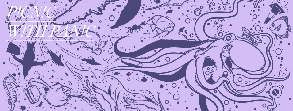
Miss Julie - Opera illustration
2 Months ago I made this illustration for Norrlands Operan, the opera house in Umeå. It's the poster for
a new opera version of August Strindberg's Miss Julie that they are setting up this fall.
You can read more about the event at their homepage here. Above is the final version of the illustration.
 This is the next to last version which is my favourite, it's a bit darker and less saturated.
I thought I would write a few words about the process and share some images.
The brief was to create a illustration that would work as a poster for the opera. This would be a new interpretation of
August Strindbergs classic Miss Julie, that would now be set in the 1930s colonial Africa on a rubber platage in the jungle.
They where looking for a creppy feeling with big insects and thick jungel that in a way kept miss Julie from leaving.
I started going throu old photographs of hairstyles and clothes from the 30s along with pictures of jungle, plants,
rubber trees and alot of insects to find the right style and inspiration.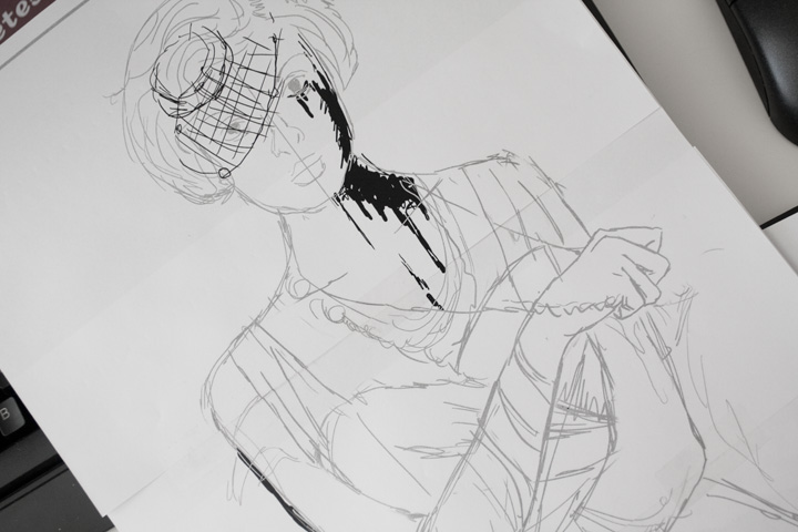 Here's my first rough sketch, I think I had some thumbnail sketches in a sketchbook to but can't seem to find them right now.
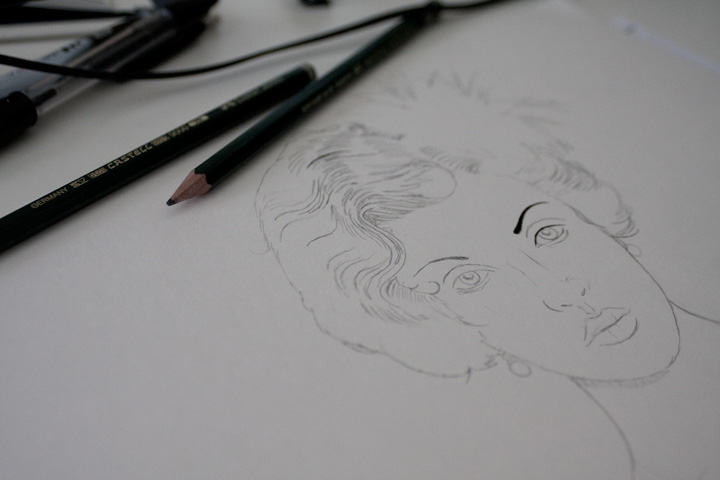
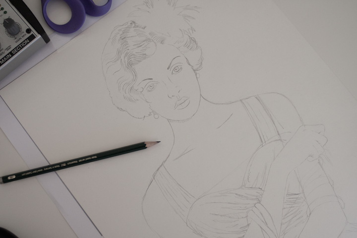 I then continued on to a pencil sketch of Julie leaving the background for now.
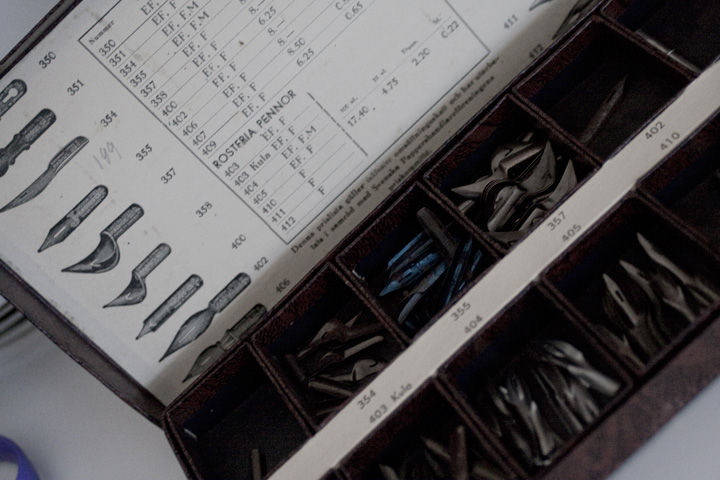 After that I started inking. I found this really nice box of nibs for crow quills on a auction site, great find.
So this is what I use for the inking along with Black indian ink.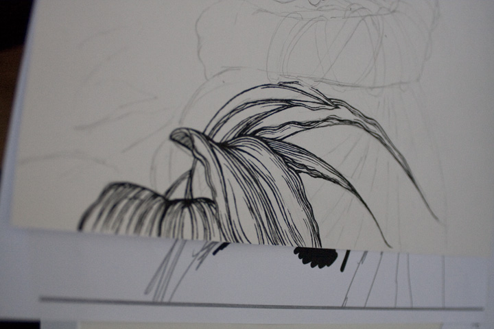
 Inking process.
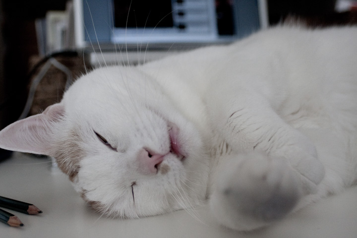 Every once in awhile Lego comes along looking for attation :)
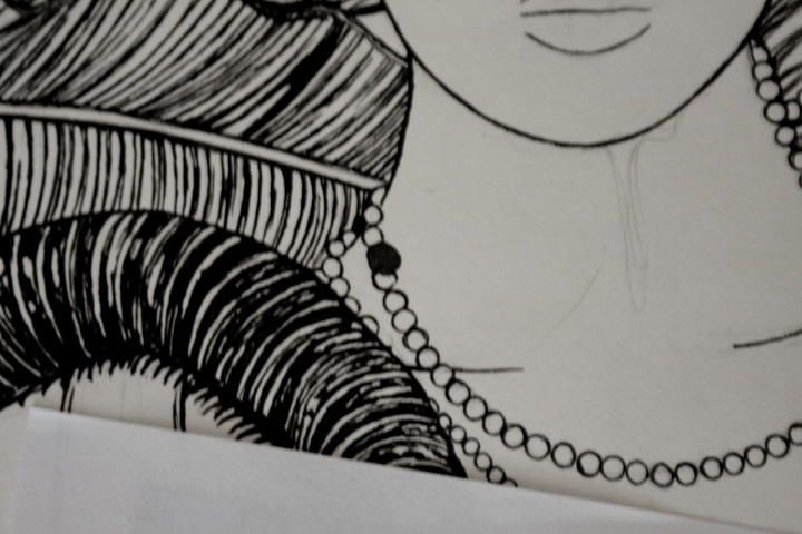 This happends from time to time it's verry annoying but I guess I'm not that used to inking with a quill yet.
If you can't see what I mean it's the black spot that is suppose to be a white pearl in a neackless.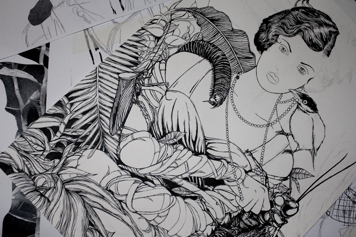 Almost done with the inking.
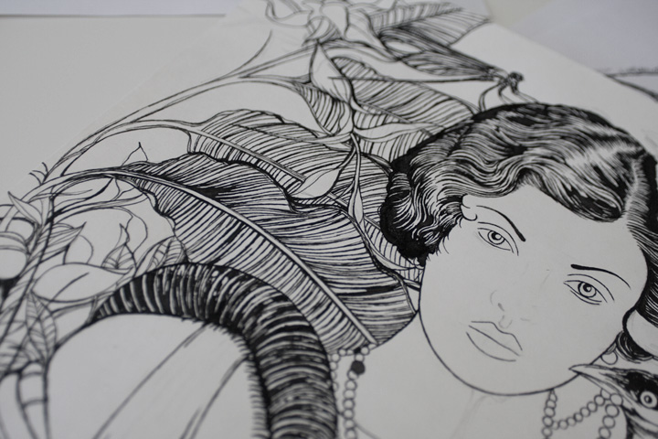
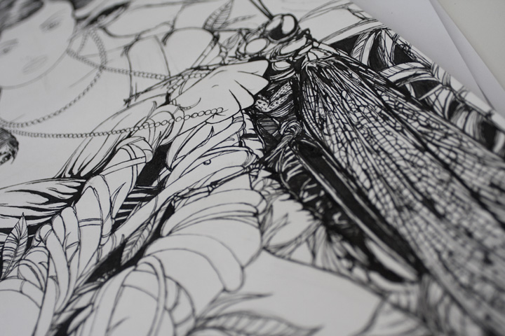 Details...details...details it's hard to stop when you work on a highly detailed drawing you can always add more and more.
The trick is know when it's enough. So this is the final inked drawing, now time for some clean up work on the computer and coloring.
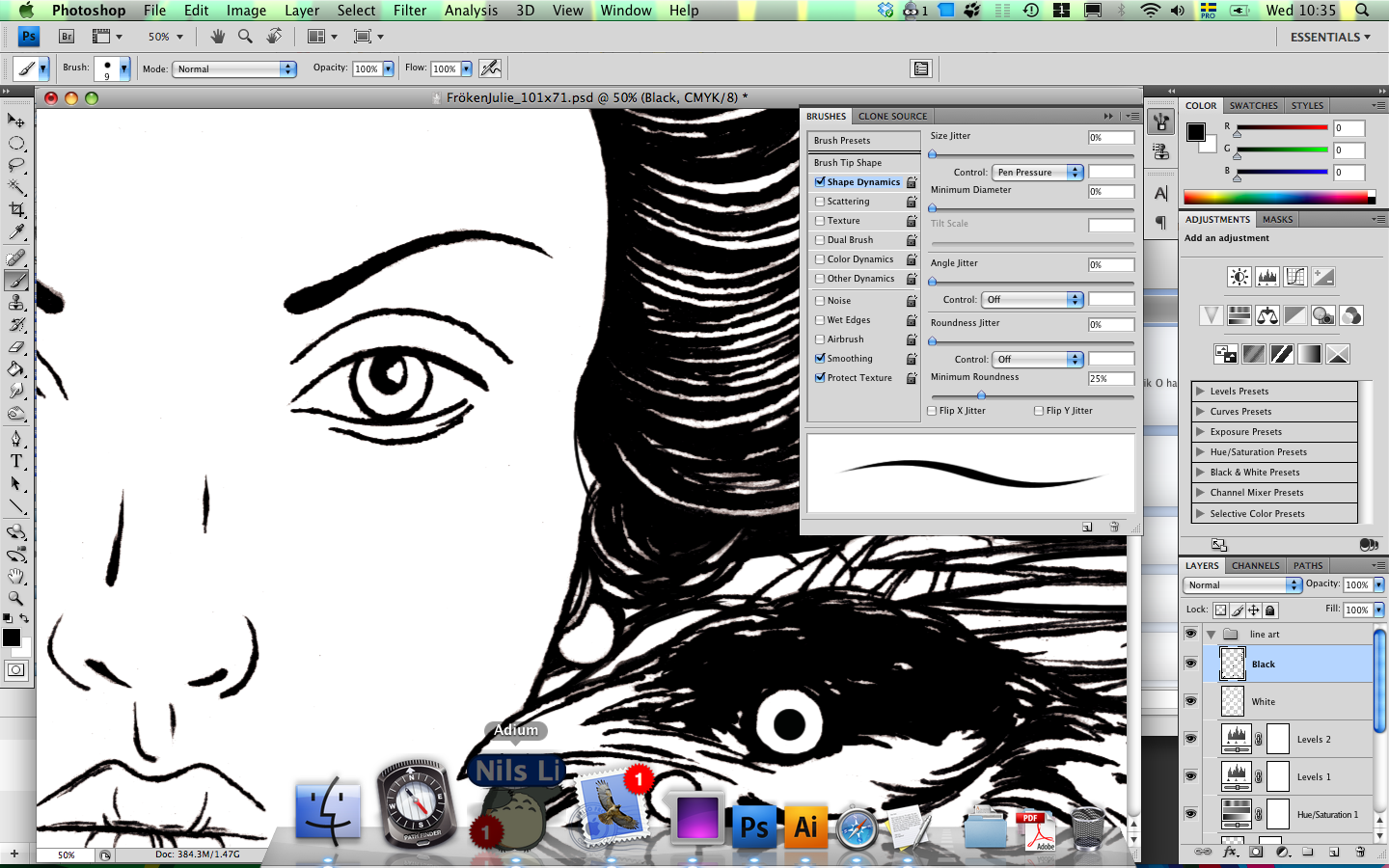 I scanned the drawing in 2 sections, because it was drawn on a A3 sized paper and I don't have that big a scanner.
So 2 sections then pieced it together in photoshop and cleaned up the lines.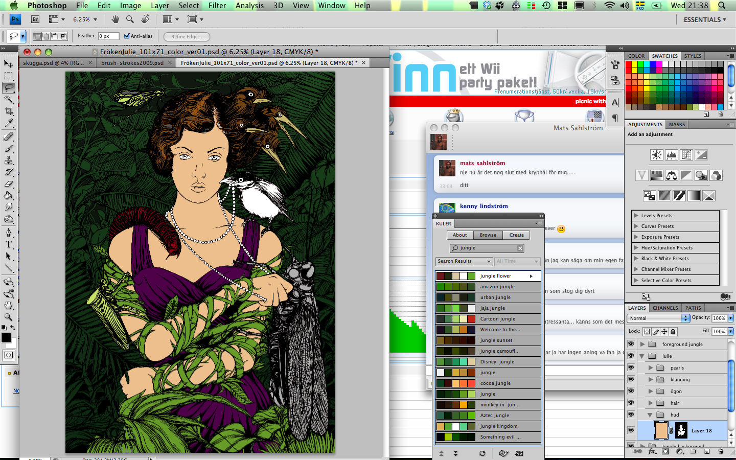 Laying out some "flats".
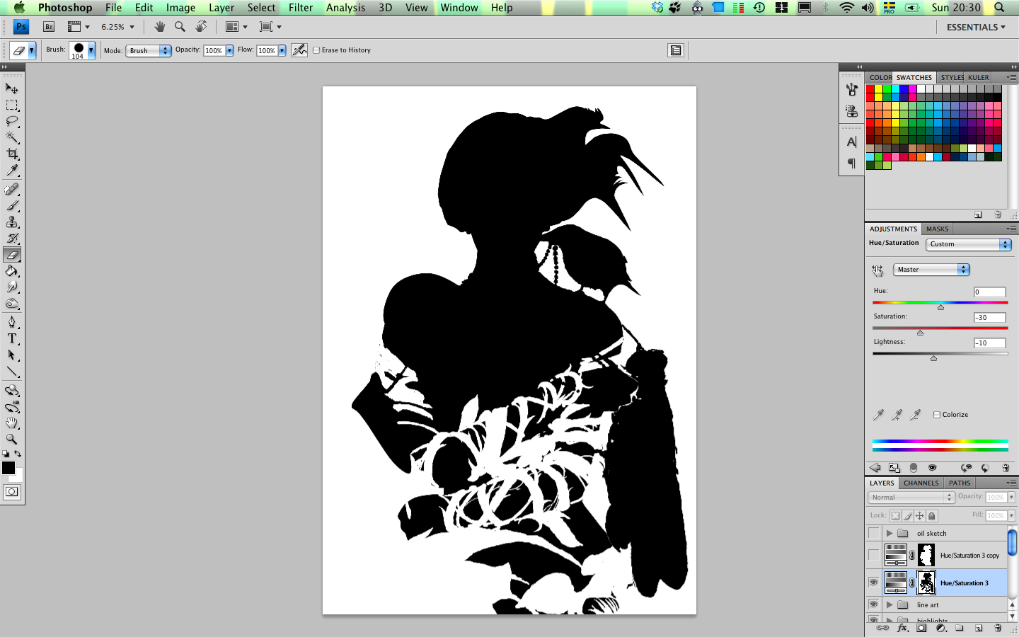 And setting up some different layer masks.
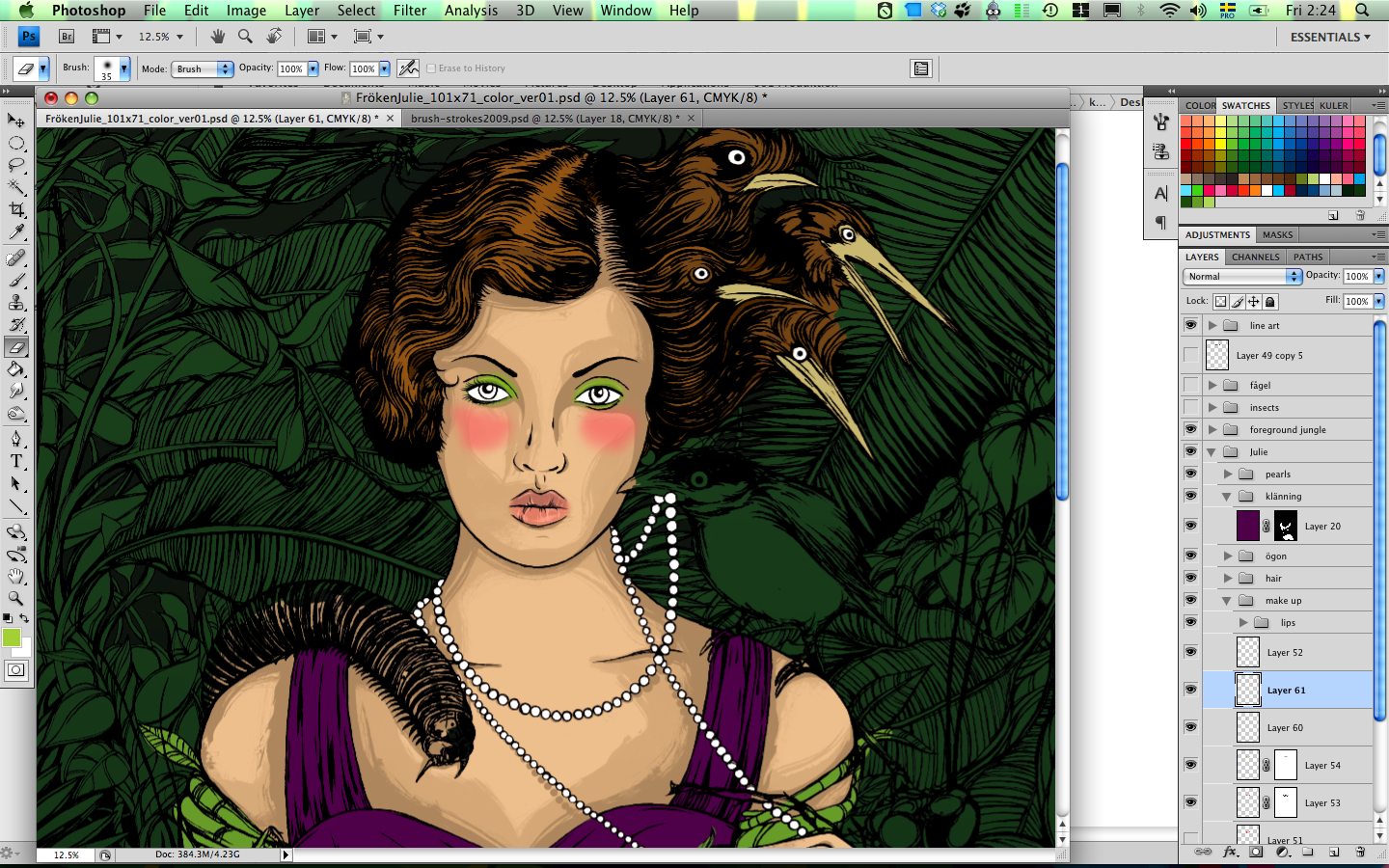 So now we are moving on to the coloring.
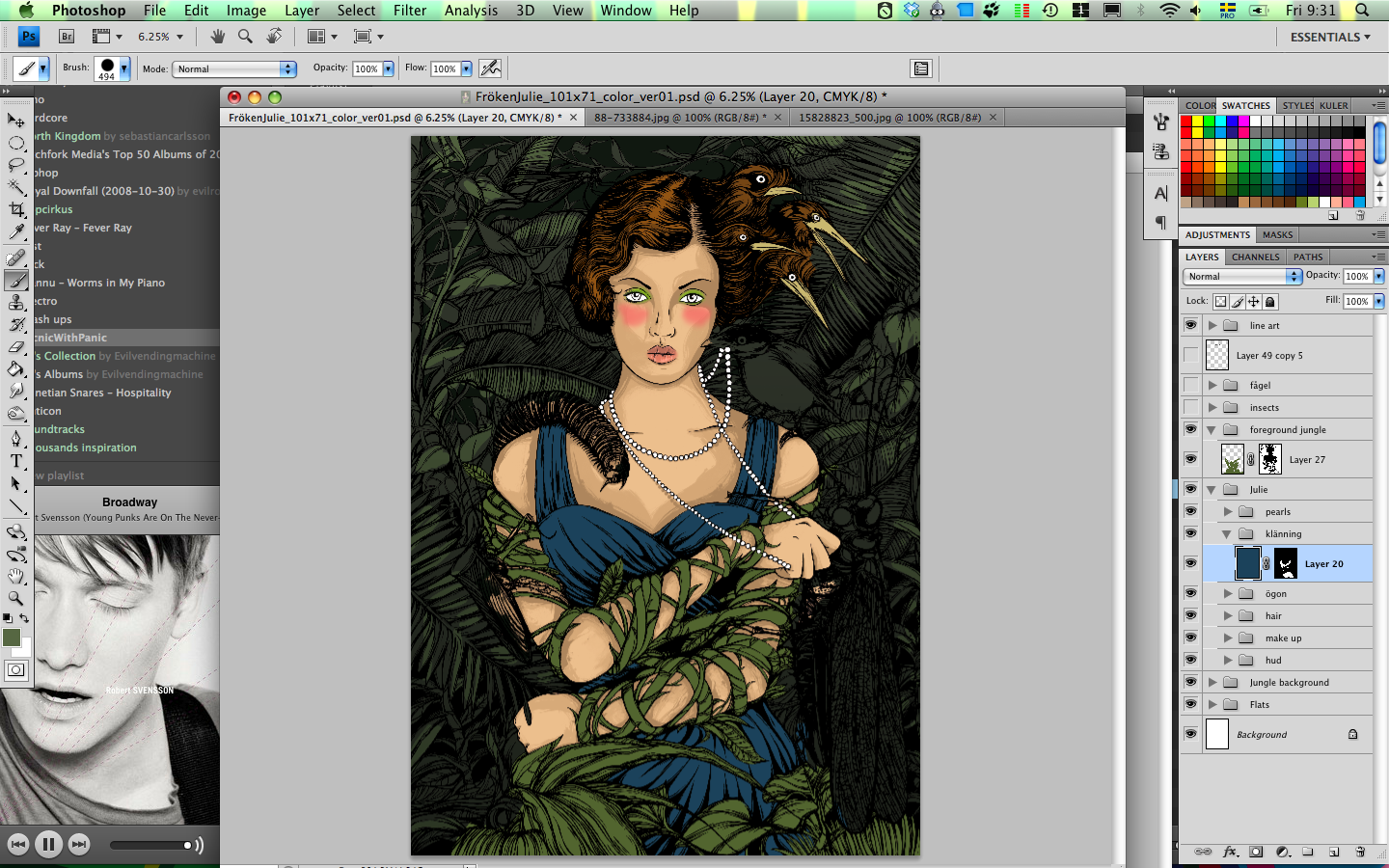
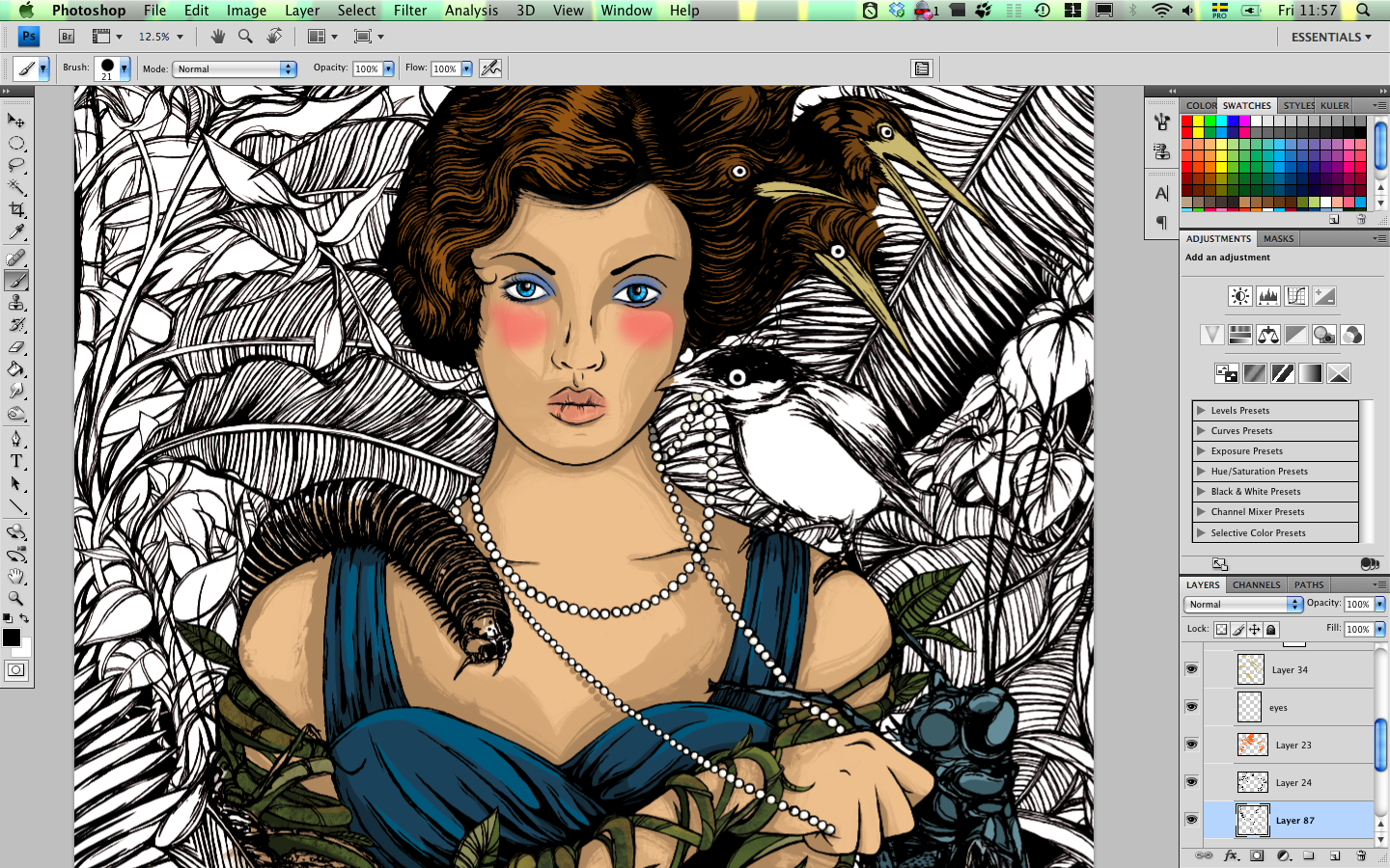
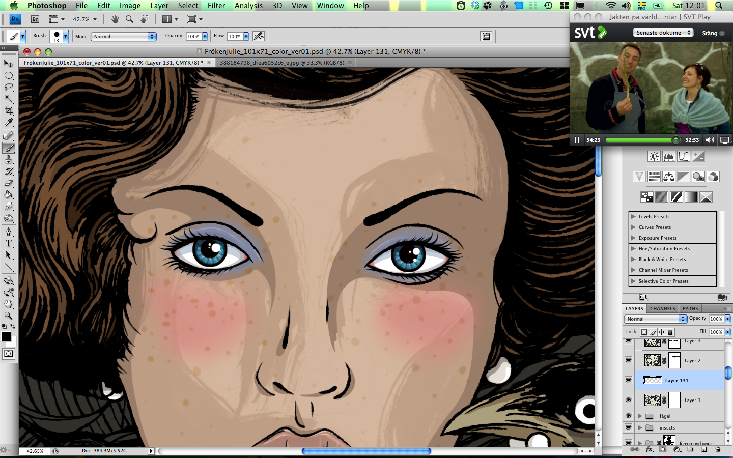 Adding details to Julie's face, some eyelashes and freckles.
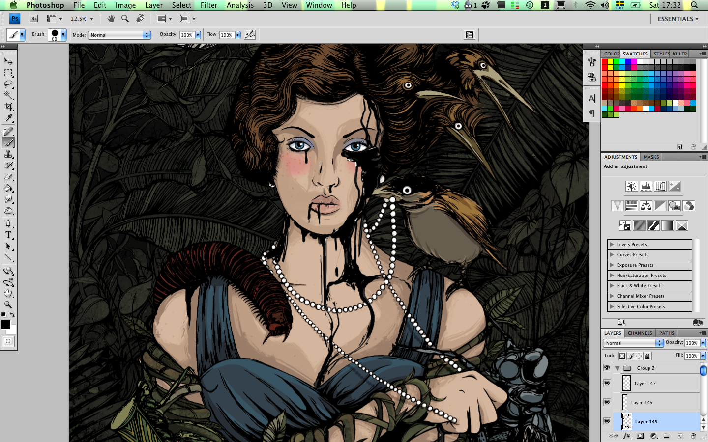 Trying out an idea I had from the beginning with black liquid rubber running down Julie's face and arms.
But I felt it would have been a to dark and scary look for this project so I decided to leave that out.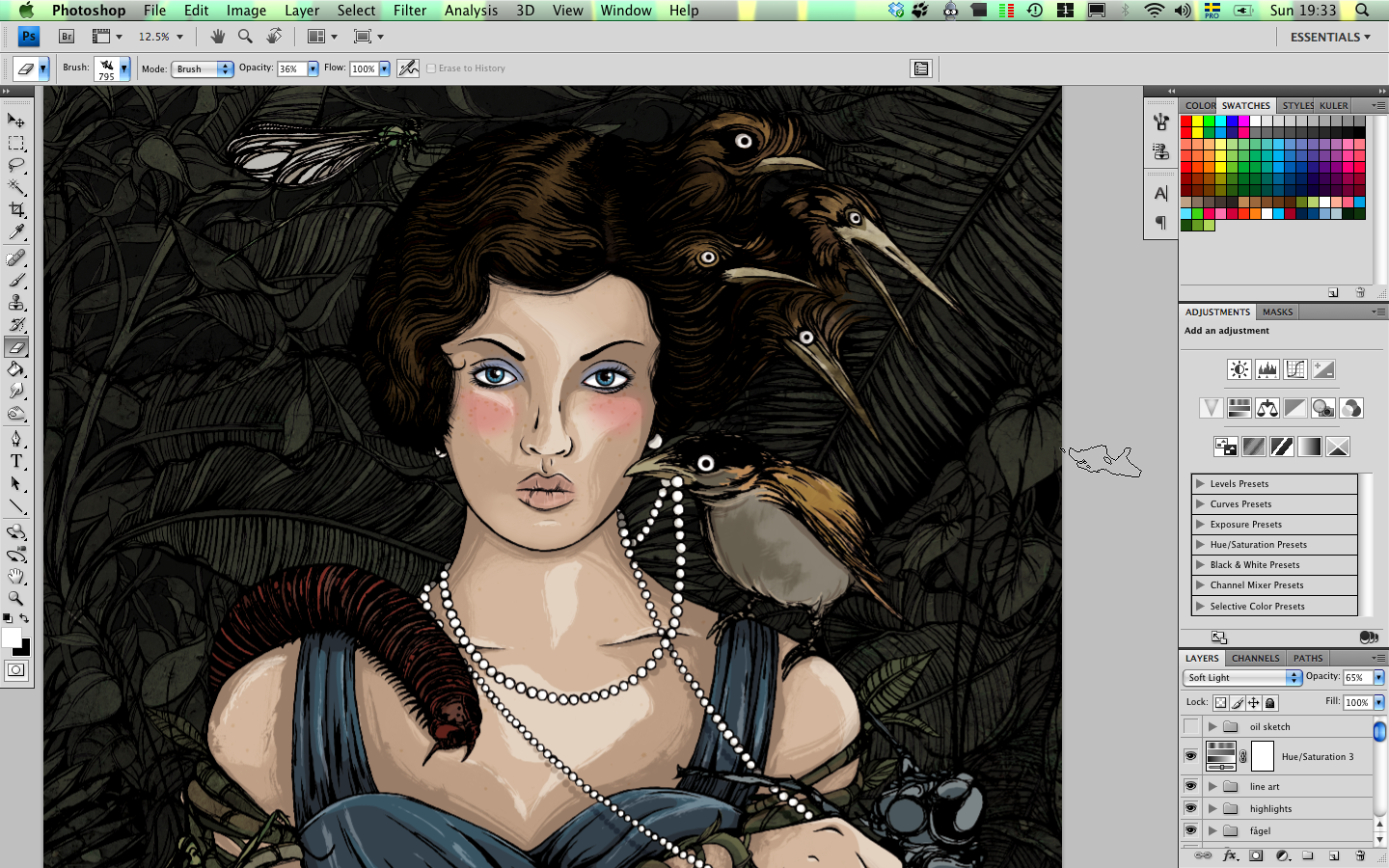 Adding some more highlight to Julie's skin and some other parts of the illustration like the birds and hair.
The character collects birds in the opera so that's why the are incorporated and the hair starts to form bird,
giving it a more surrealistic feeling and suggesting that her situation is also a struggle for her in her mind.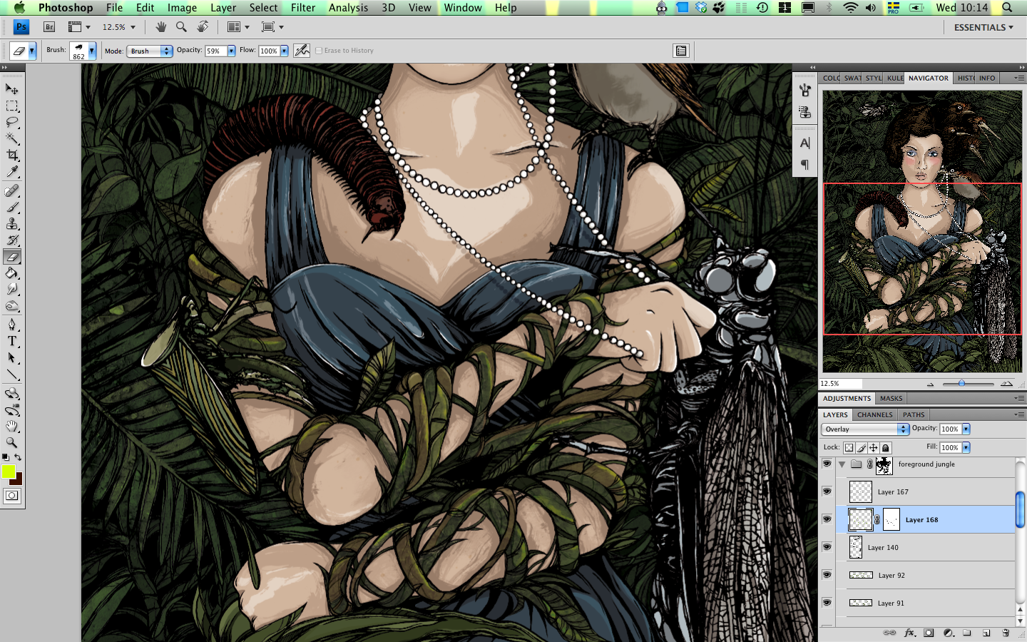 Adding some final details to the veins entangling Julie's arms.
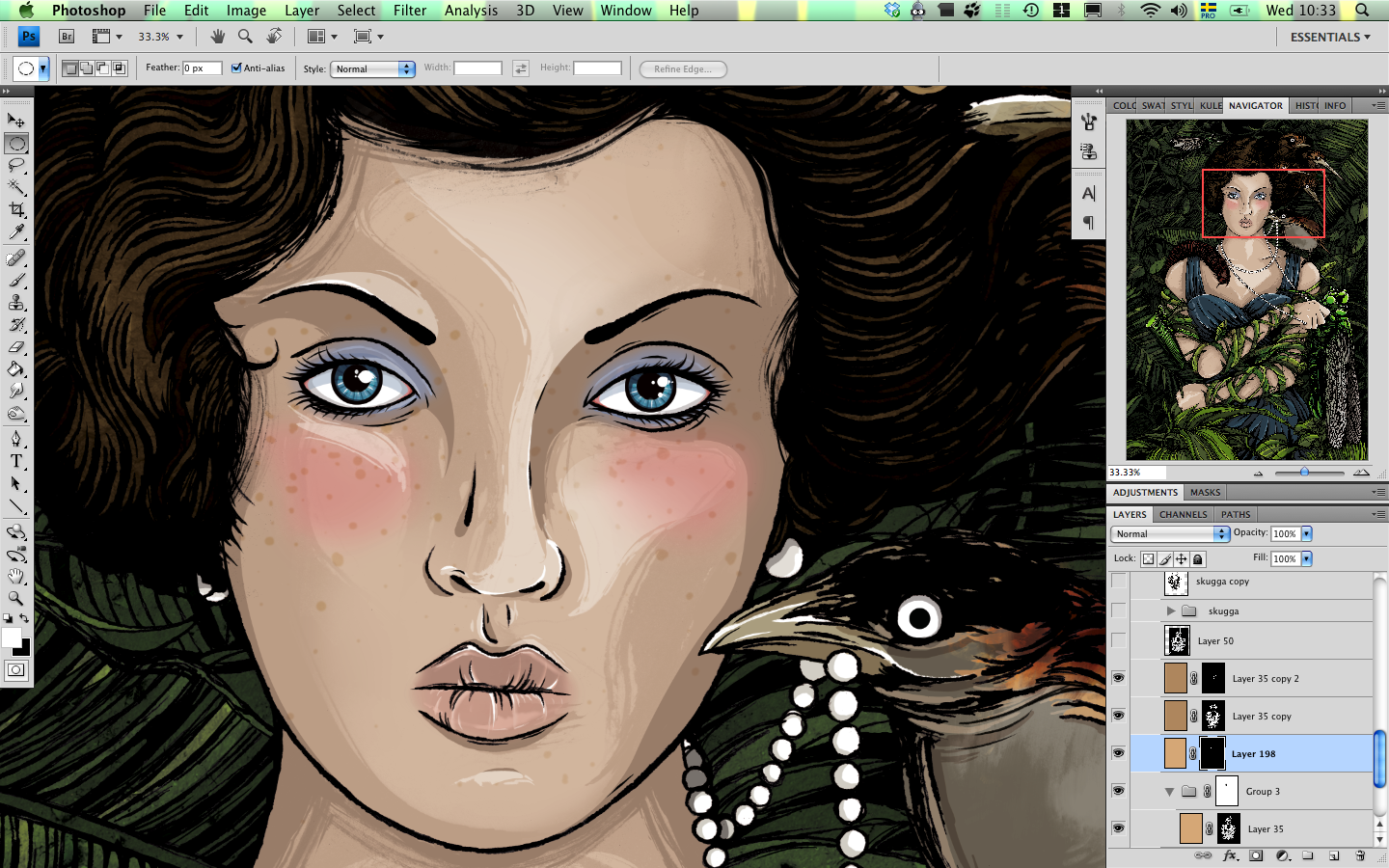 And some final touches on Julie's face, some extra highlights here and there and so on.
Scroll to the top to see the final version again.
This was a very fun project and I've been looking forward to doing a project in this style for a long time.
So I finally got a great subject to try it out, and the end result is really nice I think.
Illustrating 1930s fashion and hairstyles, and thick wild jungle is really fun so I will probably return
to that in one way or another in future illustrations.
Anyway I really like the way this turned out, I hope you do to :)
![]()

6 comments:
Snyggt kenny! Jag är ett stort fan av just den här pjäsen så det här gav god försmak!
Cool! I like the way you posted this step by step and it's good to see some hand drawn illustration using traditional methods like pen and ink. I really like the original black and white image!
Exelent Kenny!!. I really like your work. :)
Saludos desde Mexico .-.
Ciao.
SKönt å se att du inte la ner 25 timmar på att hand-vektorisera den, Kenny :)
Bilderna får en mycket finare ruffhet och "äkthet" av att man ser riktiga linjer och handarbete.
Fem toasts av fem möjliga.
Thanks for sharing your skill.
Karma will repay you ;D
Kudos from Italy,
Lily
Nice post. Very nice. Actually the images tell everything about your method of working.
I also like the black pearl. My dad used to teach me that the smudges and mishaps only make the image more lively so don't be afraid of them.
Post a Comment